A Creative Marketing Agency
BOISE, ID
There’s a reason rebrands make everyone suddenly become a logo critic.
One day, a brand changes colors to simplify its icon or gives its website a full personality transplant. Then the internet clocks in for its unpaid design shift with an array of opinions.
You have gung-ho people who love the changes and the haters making it everybody’s problem. Then you have people who decided the old version was “iconic,” even if they hadn’t thought about it in years.
So, if you’re thinking about undertaking a rebrand, know it’s the most visible move you will make as a company. Because at the end of the day, brands are more than professionally curated logos sitting in a file somewhere so change shouldn’t happen for the sake of change.
When done well, a rebrand can signal growth. You’re sharpening the positioning and connecting with the audience you want to reach next. It can make a company feel more aligned for the market it is stepping into.
When done poorly, it can confuse loyal customers. The last thing a brand needs is a lack of recognition. (Cue the brand that suddenly wants to be minimalist, modern, and “elevated” in the exact same way as everyone else.)
Before changing how your brand looks, get clear on where it needs to go first.
Not every brand evolution needs to be a dramatic reveal. Sometimes the brand just needs to stop looking like it was designed for a version of the business that no longer exists:
The levels of brand change and knowing which one you need keeps the marketing work focused and aligned.
A refresh makes sense when the bones are still good, but the brand feels underdressed for where the company is now.
The strategy may still hold. People understand what you do, and the story still has equity. But the creative has visuals that feel dated with a website that no longer reflects the quality of the work. You don’t want to have social templates that look a few eras behind the team using them.
This disconnect often appears after growth as the team expands and services become more defined. Standards rise while the company gets bigger than the identity it started with.
A refresh should make every touchpoint feel like it belongs to the same brand universe. Someone should be able to move from your website to your social content to a campaign landing page and feel the same point of view carrying through.
When the foundation is already there, the move is refinement. Keep what people remember. Tighten what feels inconsistent.
A reset makes sense when the brand people see starts feeling out of step with the company behind it.
At first, that disconnect can be easy to explain away. The services have grown, so the messaging feels a little too narrow. The audience has become more specific, while the brand still speaks in broad strokes. The visuals may look polished enough, but they no longer carry the same personality or point of view as the work itself.
Then the pattern of misalignment starts showing up in less subtle ways.The wrong leads keep coming in as sales conversations take more explaining than they should. People understand pieces of the business, but not the full shape of what the brand offers now.
At that point, more visibility may only amplify the confusion. The brand does not need to be seen by more people before it knows how to speak to the right ones.
A strong reset can help sort through what still has meaning and let go of what is holding the brand in an older era.
A brand should not rebrand because of boredom. But a perfectly good identity can start to feel weak when the system around it gets messy.
If one campaign sounds like it came from a different team or a social series starts borrowing the internet’s personality of the week, that kind of inconsistency can make a strong brand look like it’s having an identity crisis.
The website has the right message, but the content keeps switching lanes before anyone has time to remember it.
Before changing the identity, look at how the brand is being used. Maybe the creative system needs clearer rules or the team needs to commit to one message long enough for it to stick. Maybe the visual identity is strong, but every channel is interpreting it a little differently.
Staying the course can still be strategic when the foundation is right. Rebranding takes time, investment, internal alignment, and a reason stronger than restlessness. Without that, the work can turn into a very expensive distraction.
Recent brand changes prove one thing pretty clearly: audiences are paying attention. They may not know the strategy deck behind the decision, but they know when something feels right. They also know when something feels off.
Here’s some examples of rebrands and how they resonated with consumers:
The best rebrands know which cues are decoration and which ones carry recognition. Change the wrong one, and suddenly the detail people barely noticed becomes the thing they miss.
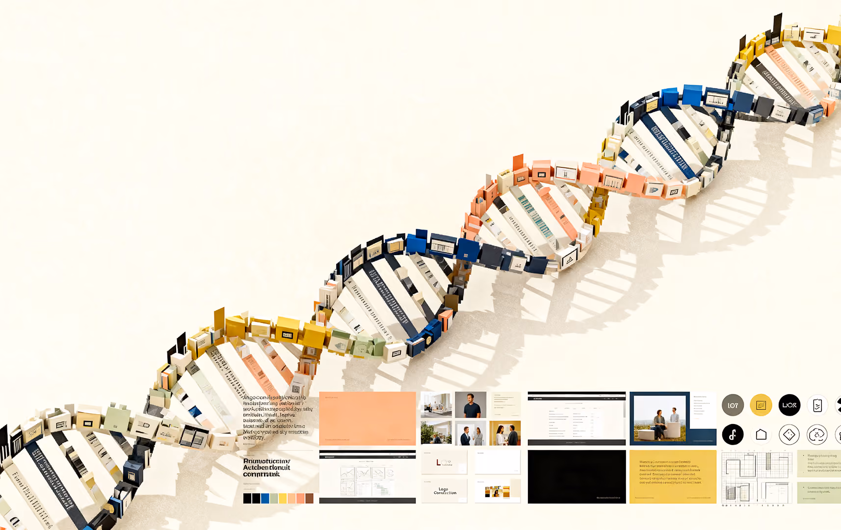
We know the rebrand conversation because we have been on the other side of it.
Tuuti 2.0 came from an evolution in who we are and who we are built to serve. The original brand had charm, color, and a strong creative spark. It gave us a place to begin. But eventually, the agency started moving faster than the identity around it.
Our work became more integrated. Strategy, social, paid, production, content, influencer storytelling, and reporting were no longer separate lanes. They became part of one connected creative engine.
The clients we wanted to reach were evolving, too: bolder brands, leaner teams, and companies that needed an agency partner with range, speed, and taste.
The old brand still had energy, but it no longer had enough range.
Tuuti needed a brand that could hold more. Less tied to where we started, more reflective of how we think, how we work, and how we show up now. The refresh moved us from a more female-forward early identity toward something bolder, more neutral, and more scalable without losing the personality that made Tuuti feel like Tuuti.
Before making the leap, the decision needs to come from more than a feeling that the brand is ready for something new:
These questions can separate a legitimate rebrand need from a temporary creative itch. The key is knowing which move will actually move the brand forward.
A rebrand can be powerful, but only when it is grounded in strategy. The right move depends on what your brand has outgrown, what still has value, and where you want to go next. Strategy has to come before visuals, messaging, or channel execution.
Strong creative should make the brand more recognizable, not just more attractive. It should help people understand you faster, remember you longer, and feel the difference between your brand and everyone else trying to sound “fresh.”
Whether the answer is a visual glow up, a deeper reset, or staying the course, the work should help your brand show up with more clarity and confidence.
If your brand is ready for its next era, Tuuti can help you decide whether it needs a refresh, a reset, or a smarter system around what already works.