A Creative Marketing Agency
BOISE, ID
Tuuti helped EllaNu evolve from a broad women’s wellness brand into a focused intimate health brand with intentional positioning, stronger messaging, and a redesigned digital experience.
EllaNu had grown into a broad women’s wellness brand but was increasingly defined by one area: intimate moisture and tissue comfort. Tuuti built the brand around that strength, repositioning EllaNu around women’s intimate health and rebuilding the experience so its clinically backed, non-hormonal support was easier to understand. The result was EllaNu 2.0, a more focused brand that feels credible without becoming cold. Its visual and messaging system makes the science more accessible and the customer experience easier to navigate without slipping into generic supplement or beauty branding.
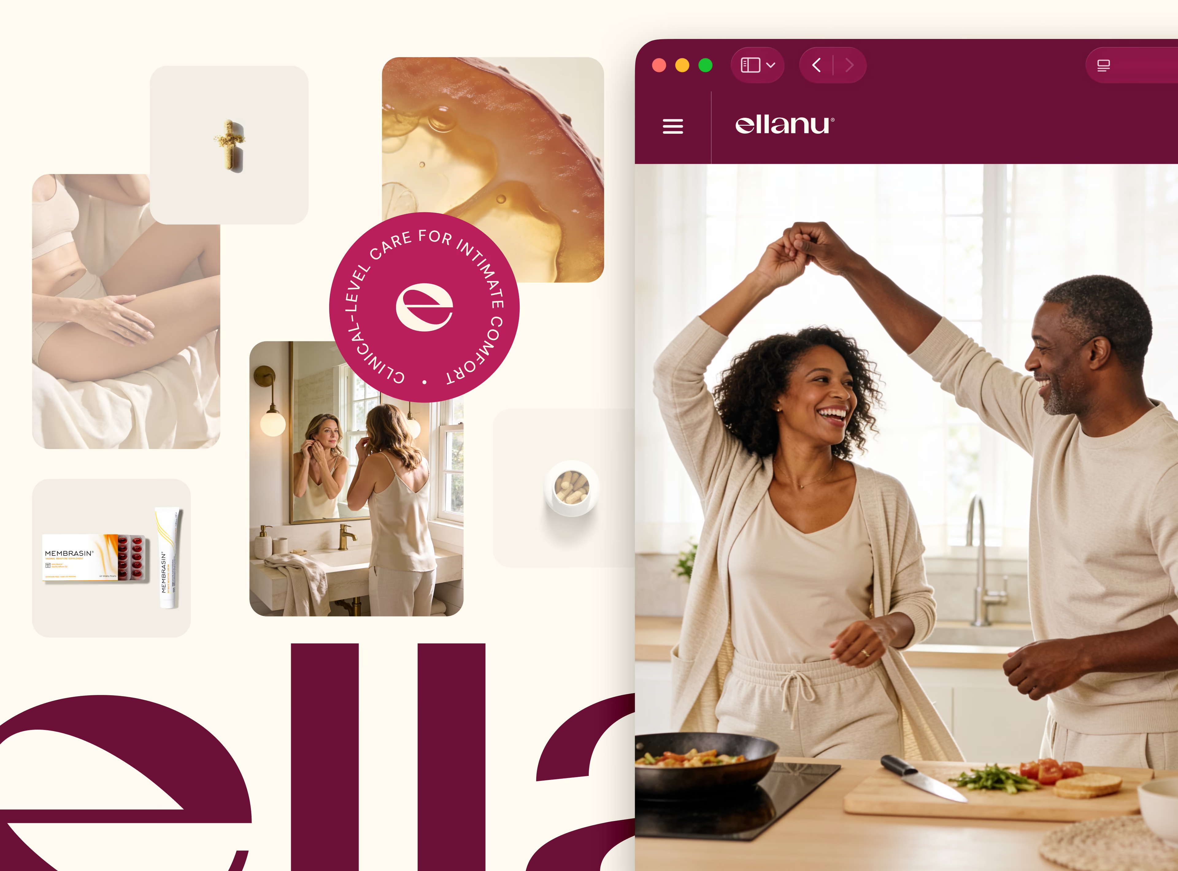
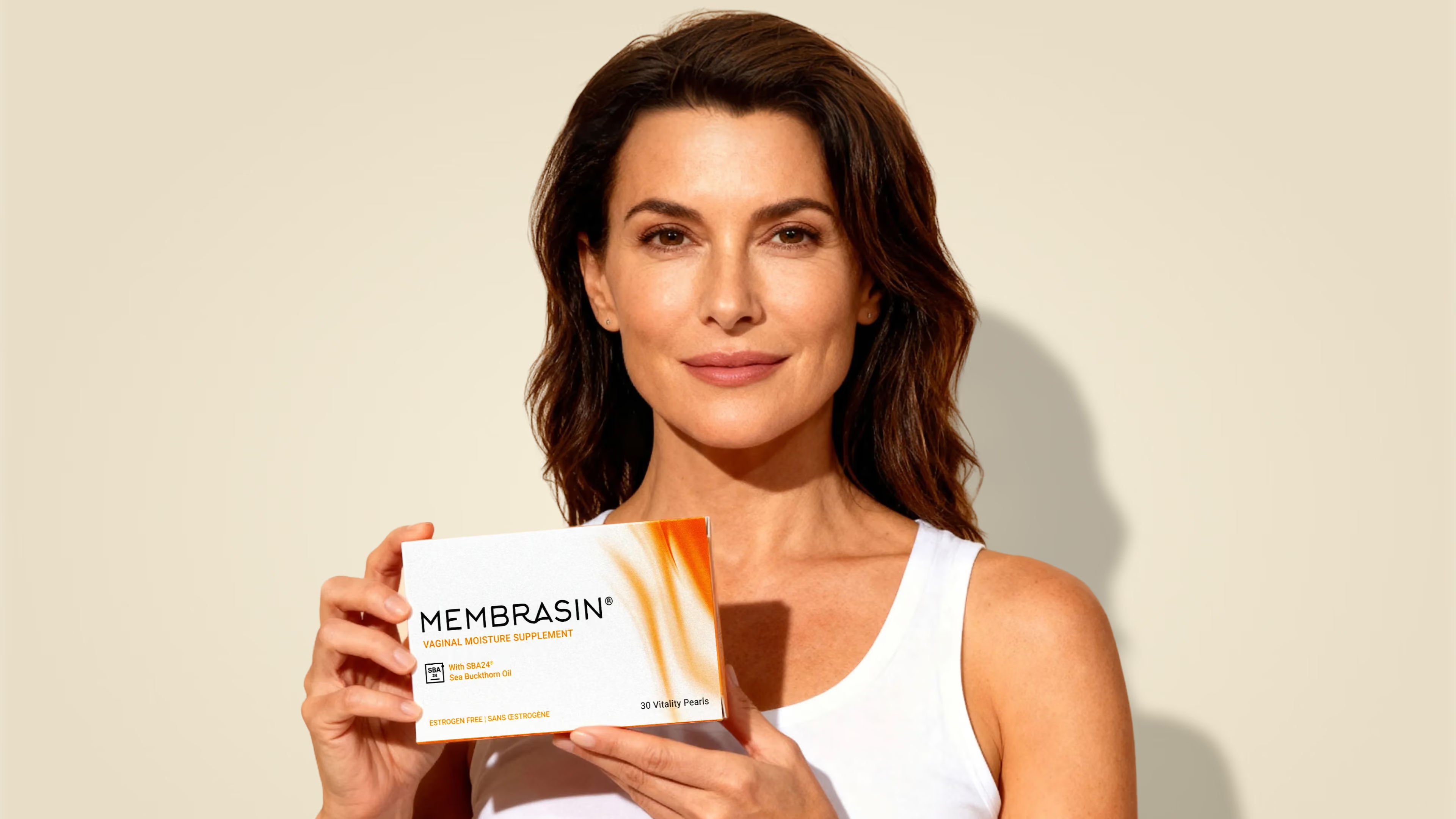
EllaNu needed to look different from the other wellness brands, particularly in the same category. The new direction moved away from muted, generic supplement aesthetics and gave the brand more presence through richer color, sophisticated typography, and a visual style that felt at home in women’s health.
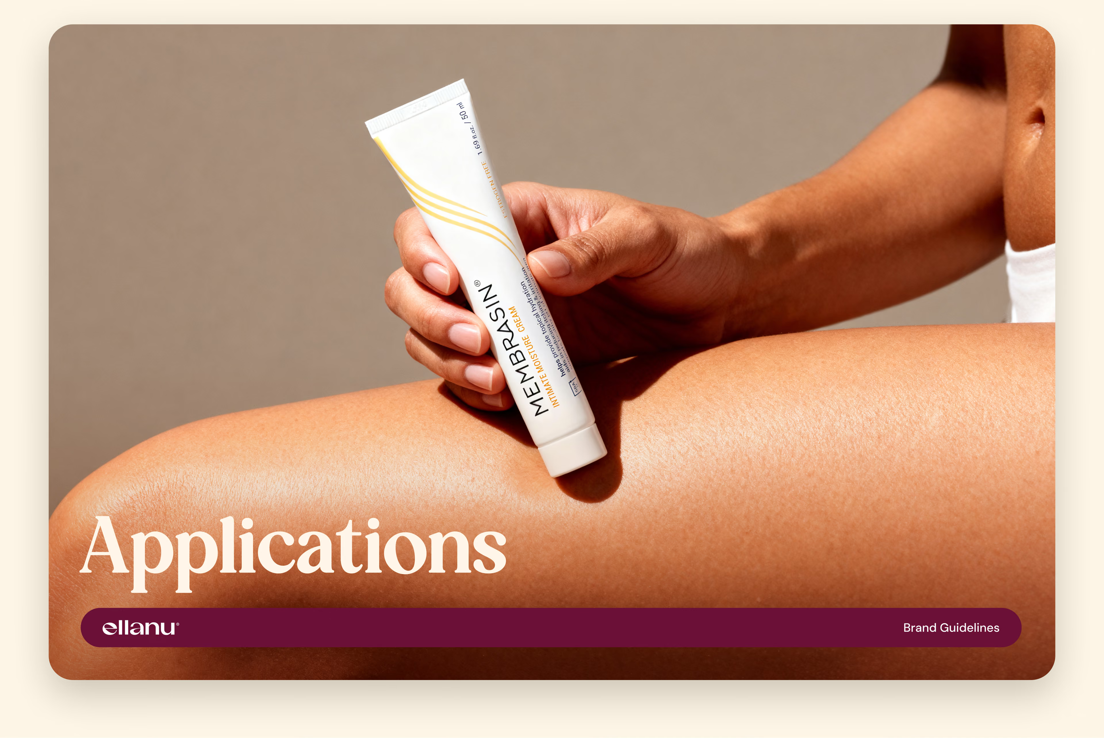
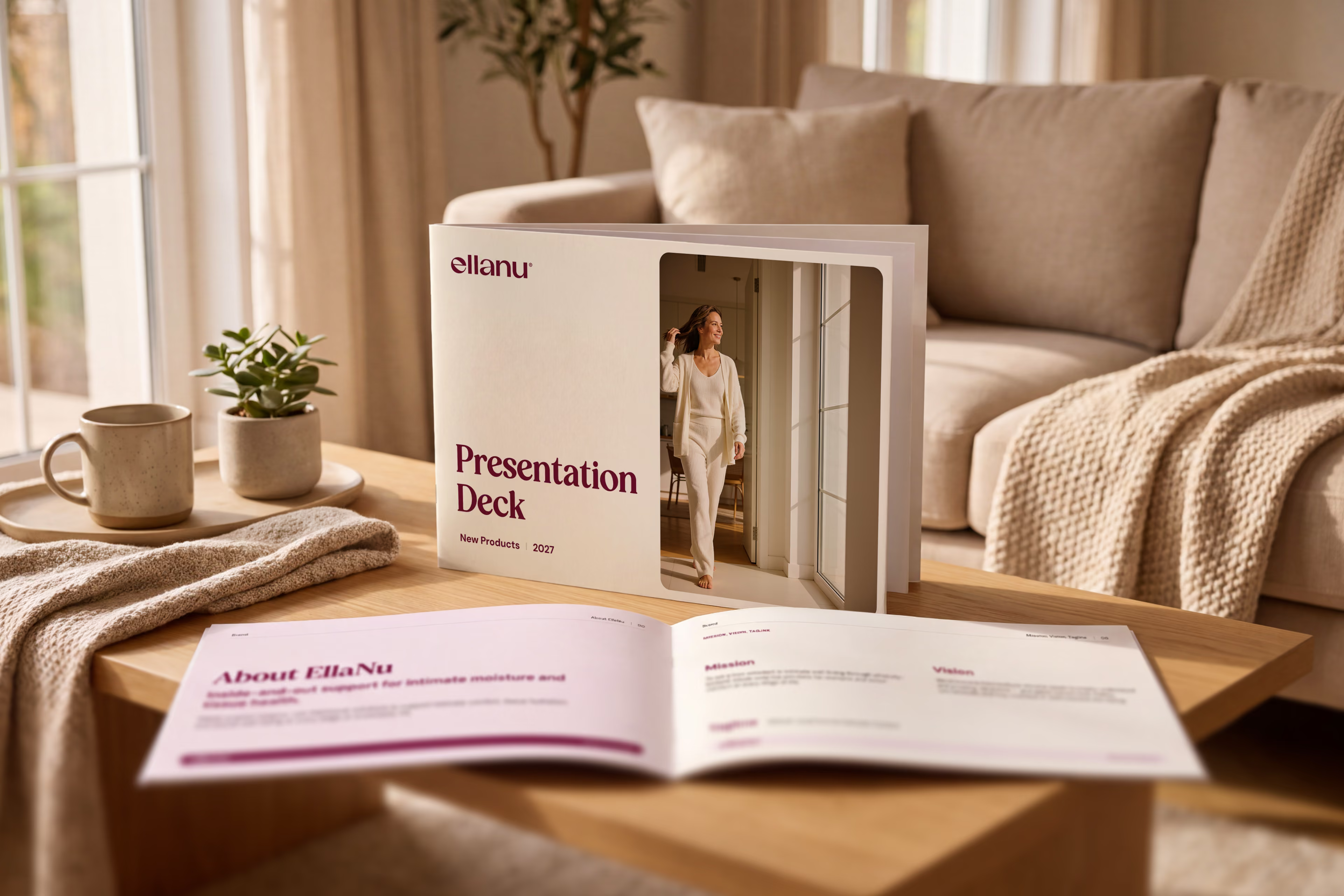
The balance was important. Too clinical and EllaNu could feel cold. Too soft or playful and it risked blending into the beauty and “pink aisle” brands the team wanted to move beyond. Tuuti brought warmth into the system through lifestyle photography and human moments, then paired it with product imagery, clinical data, and ingredient-focused details that reinforced the science behind the products.
The final identity gives EllaNu a distinct visual world that can stretch from packaging to ecommerce while still feeling unmistakably like the same brand.
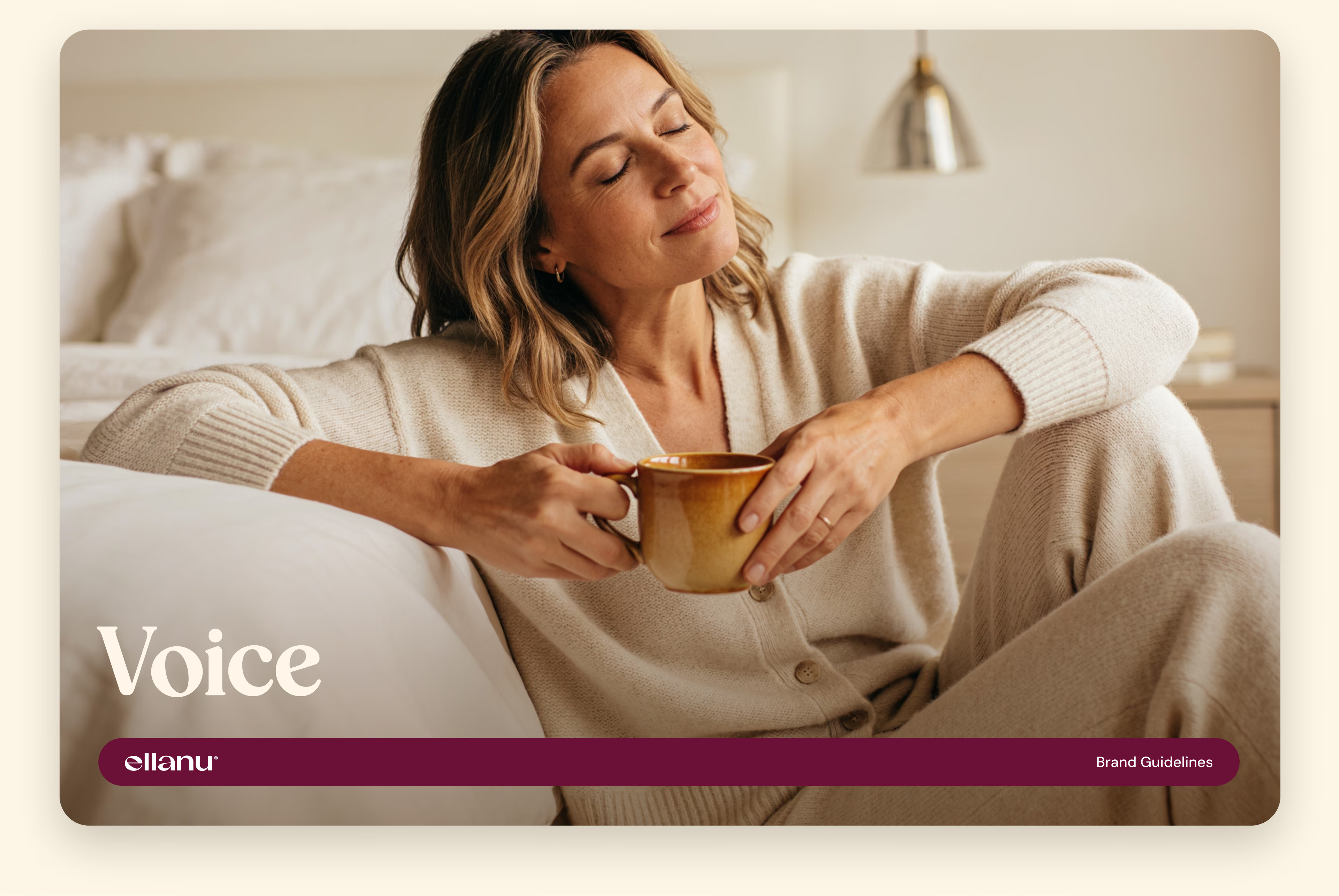
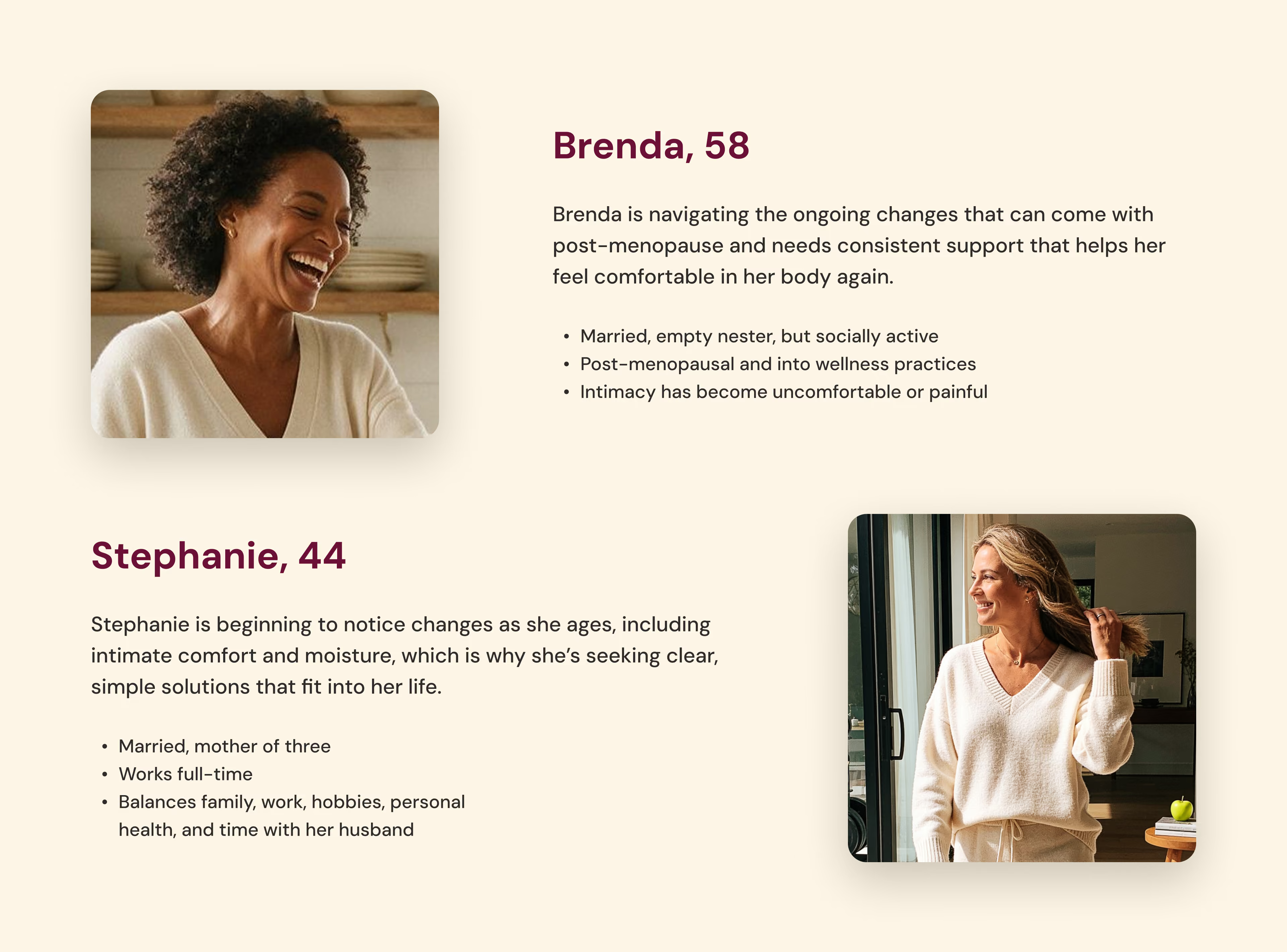

The new identity started with a closer look at the women EllaNu needed to reach. These are the women who may be noticing intimate changes for the first time in her 40s or looking for ongoing support later in life. But in either case, these women want straightforward information, credible products, and a brand that speaks to her like they know a thing or two.
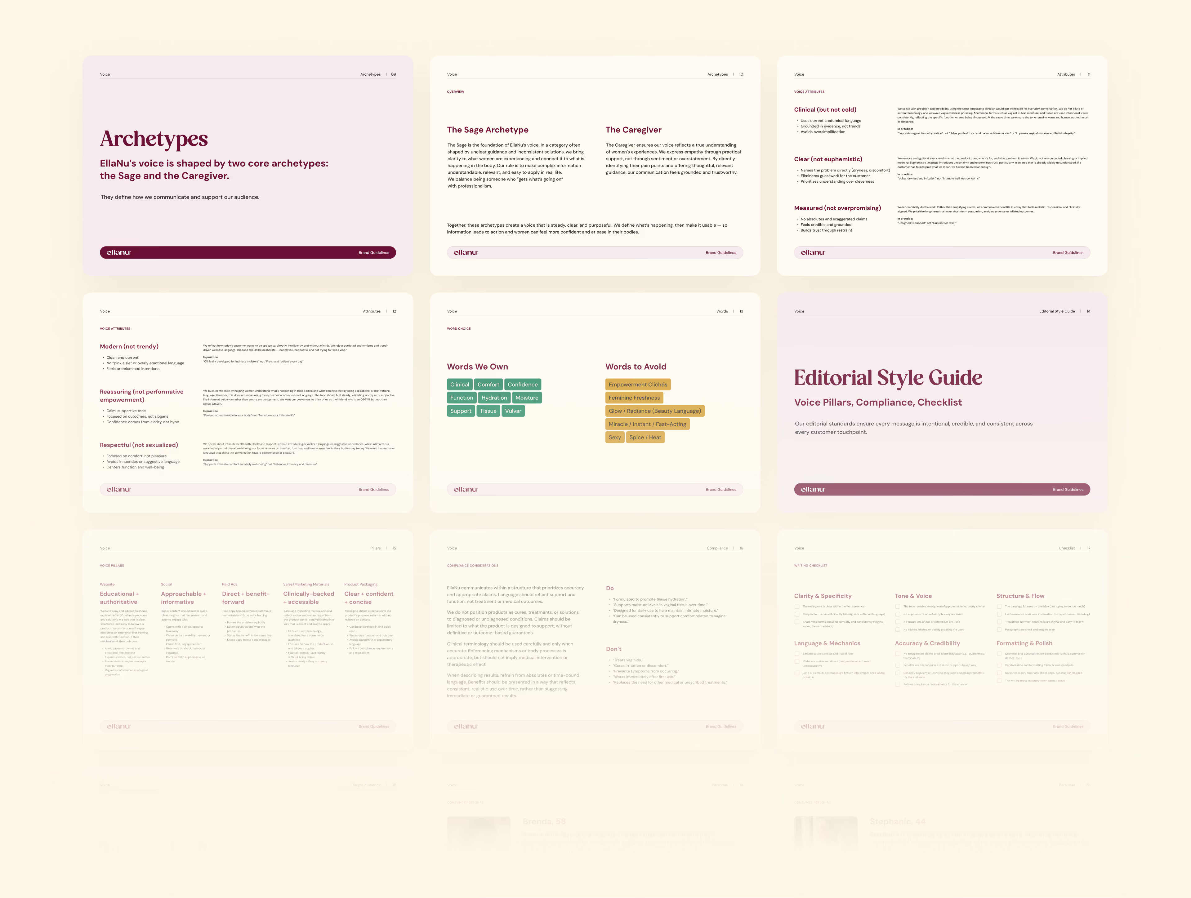
That understanding defined both the visual and messaging sides of EllaNu 2.0. The logo and brand system became more distinctive and polished, while the voice took on the balance of a Sage and Caregiver: informed enough to explain what is happening in the body, but warm enough to make sensitive topics easier to navigate.
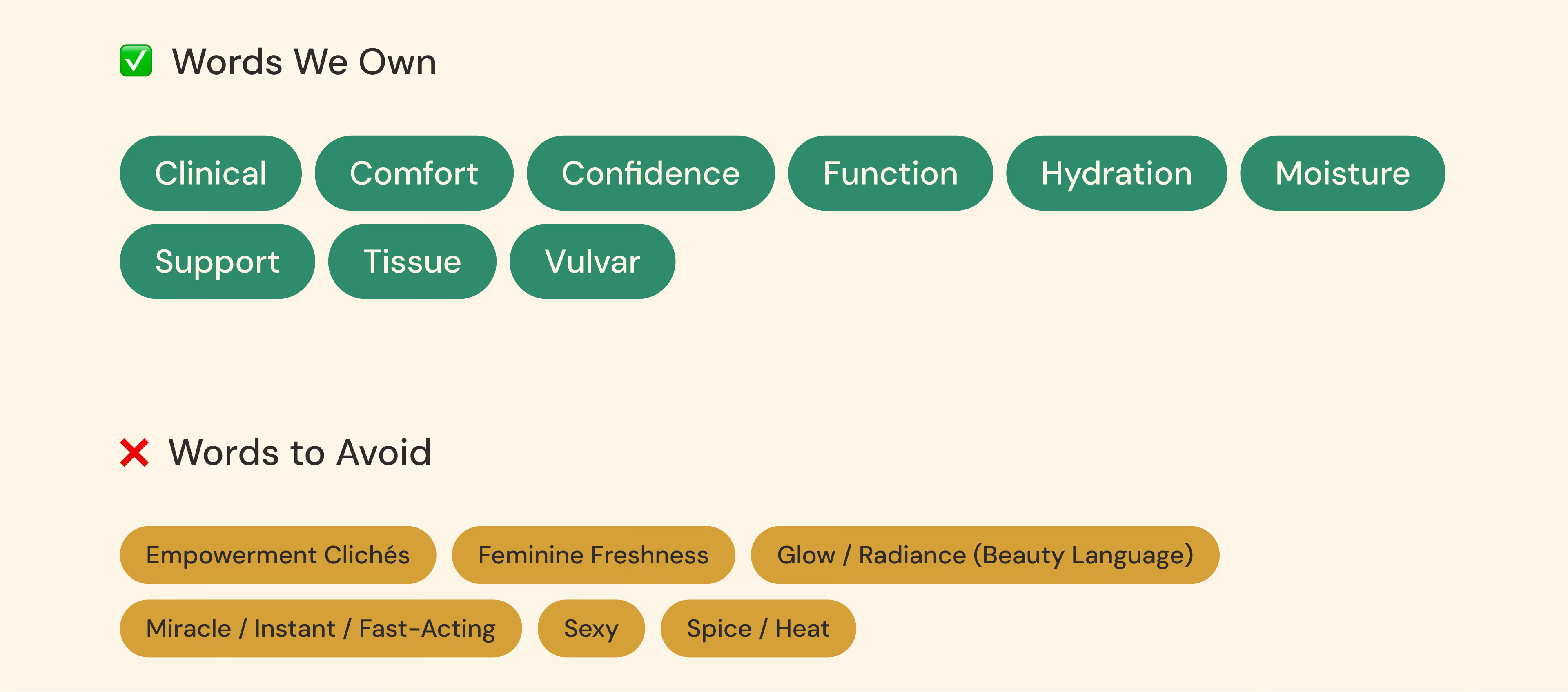
The team also defined the language EllaNu could build authority around, including comfort, hydration, moisture, and tissue while moving away from beauty language, empowerment clichés, and sexualized wellness messaging. That gave every touchpoint a shared point of view, from a product package to a landing page or educational article.
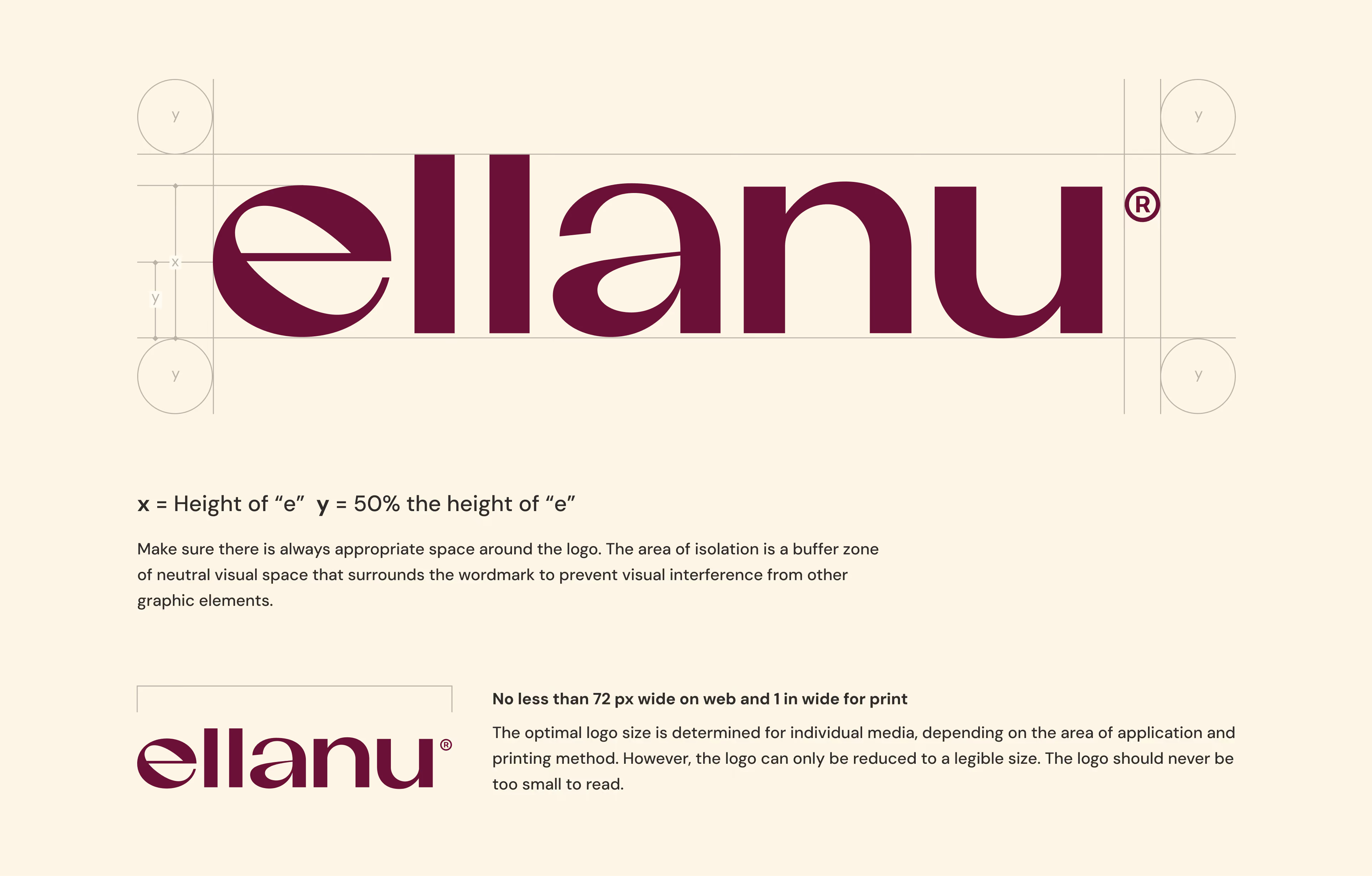
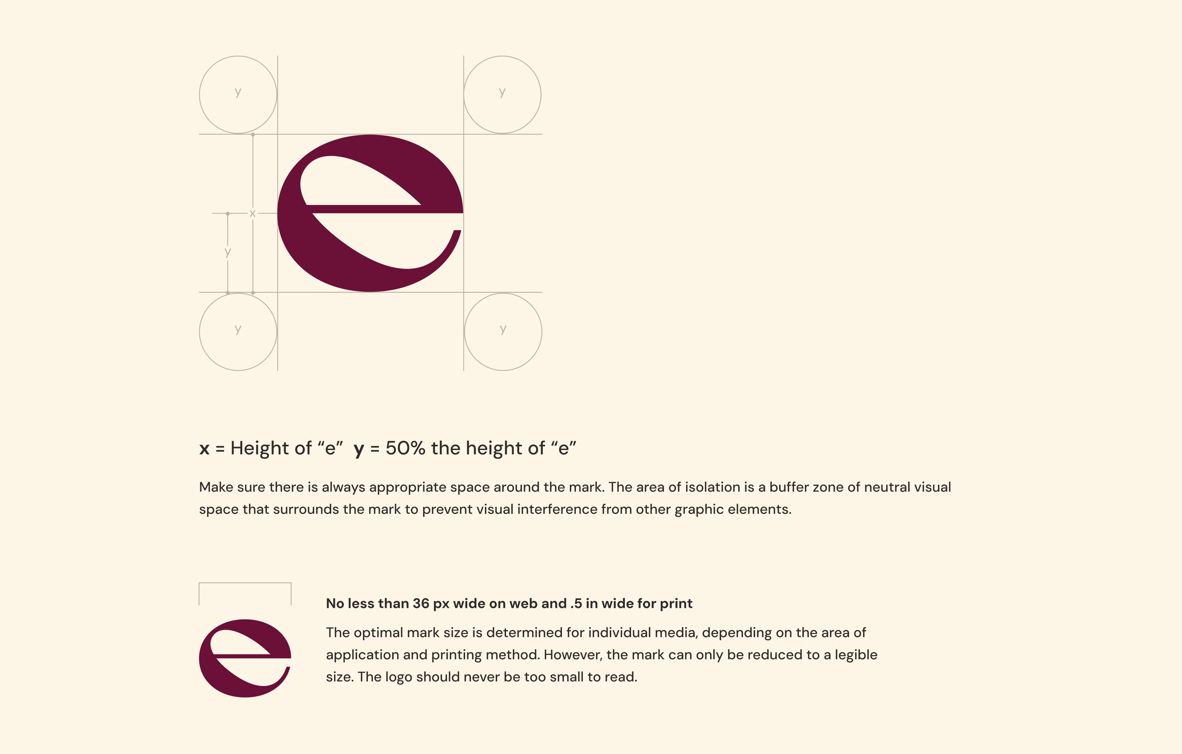

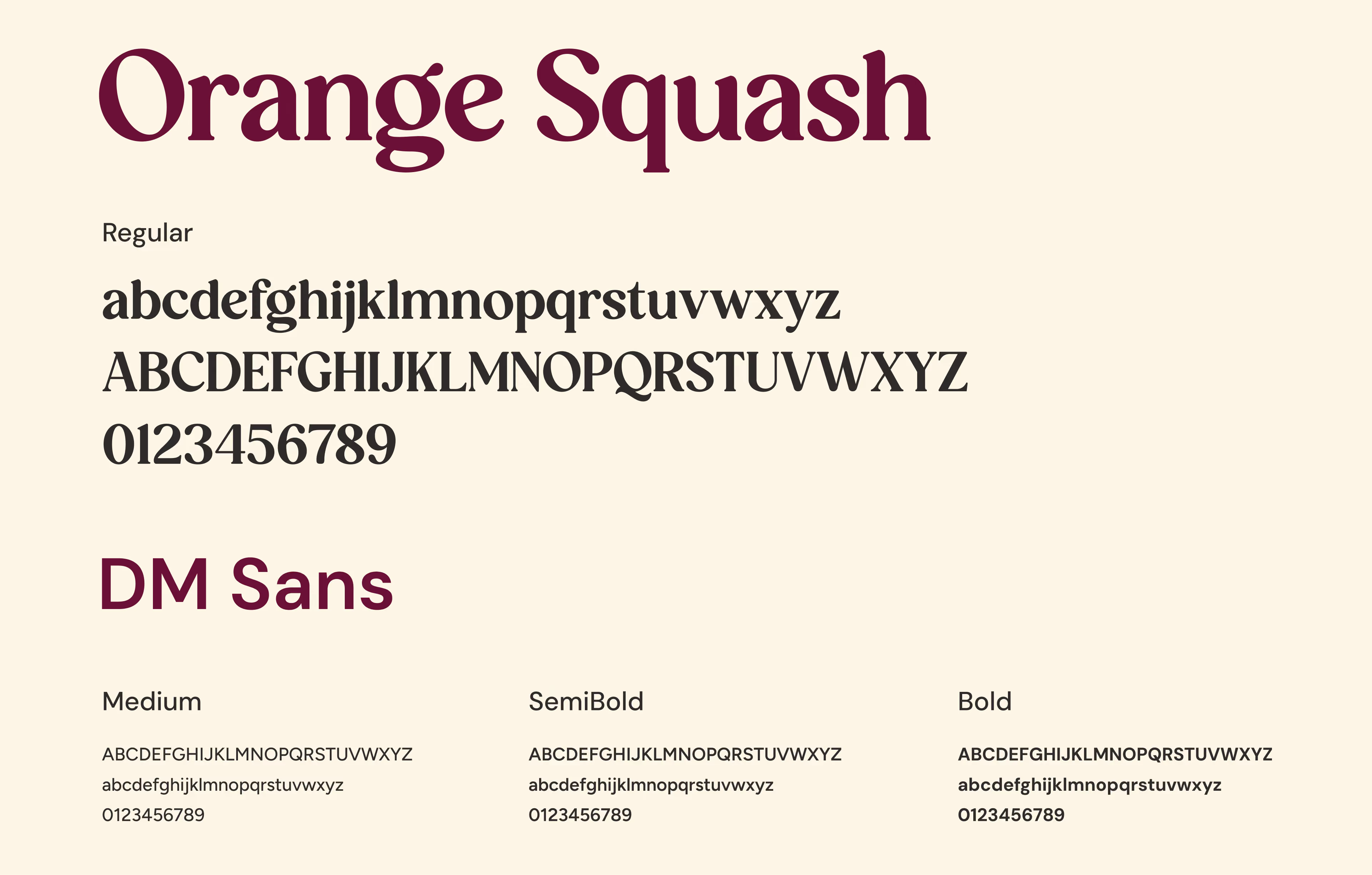

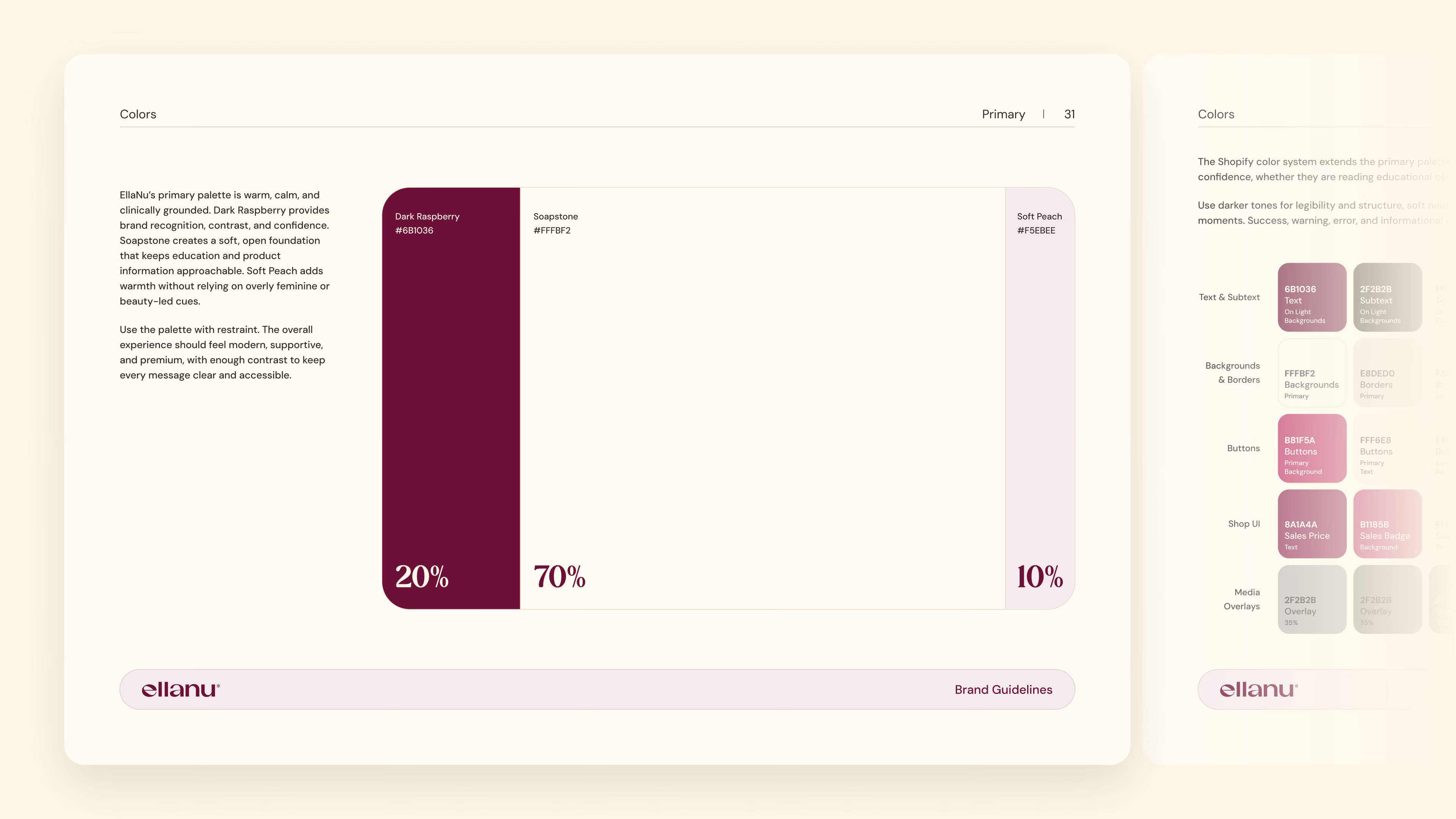


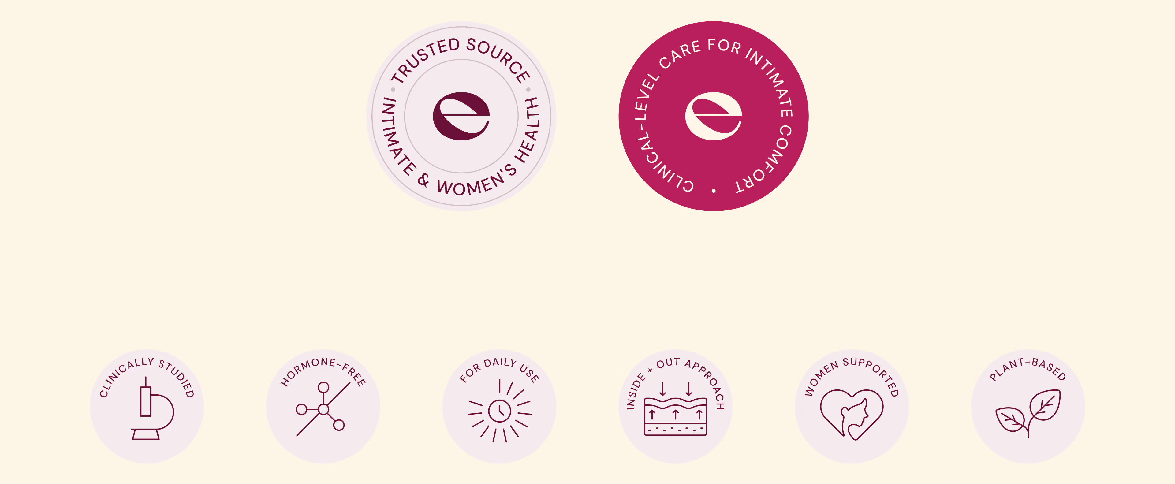
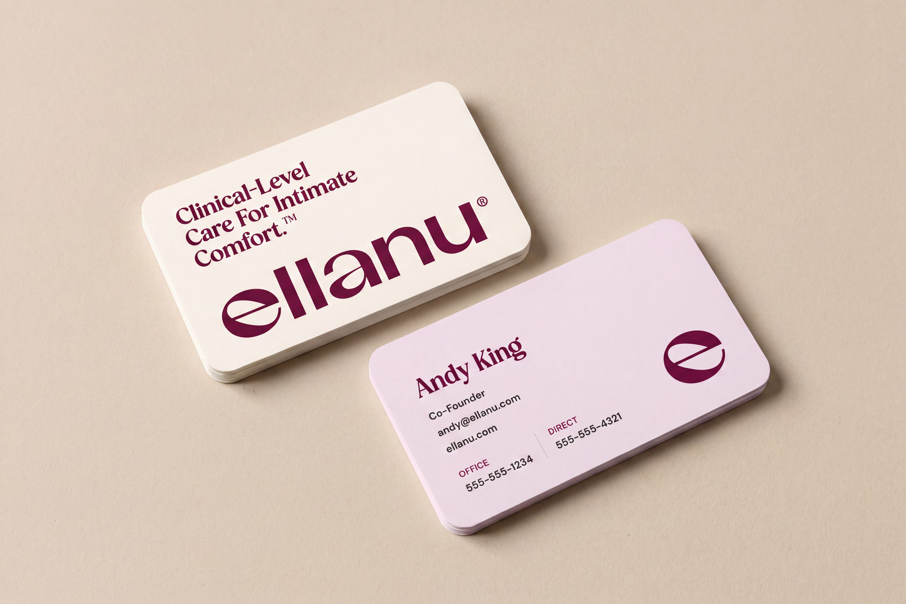
The Tuuti team sought to create a visual system that could move between intimate health education and everyday life. We paired expressive typography with a deeper raspberry palette, warm neutrals, and soft supporting tones that gave the brand more presence without making it feel harsh or overly medical.
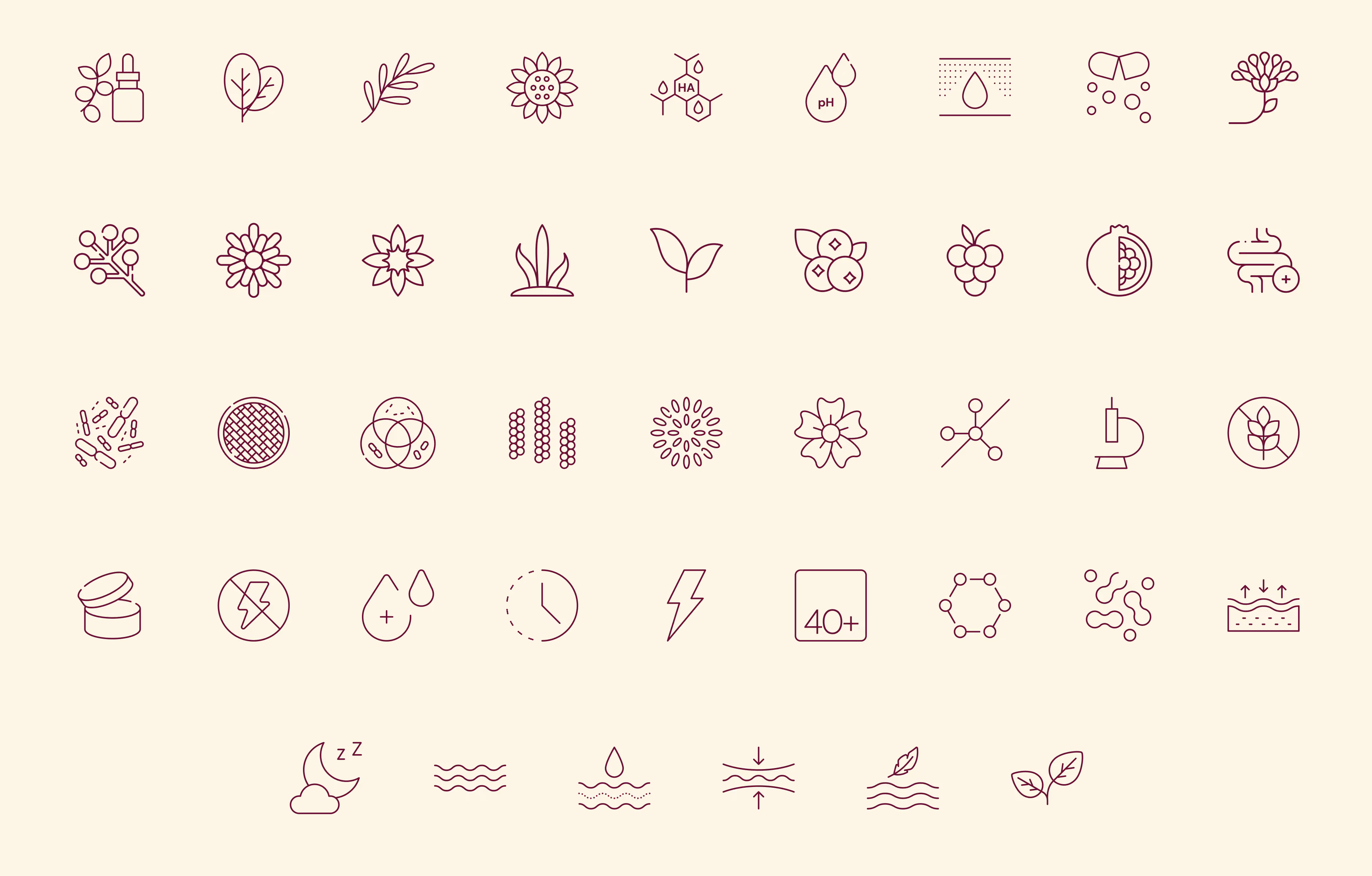
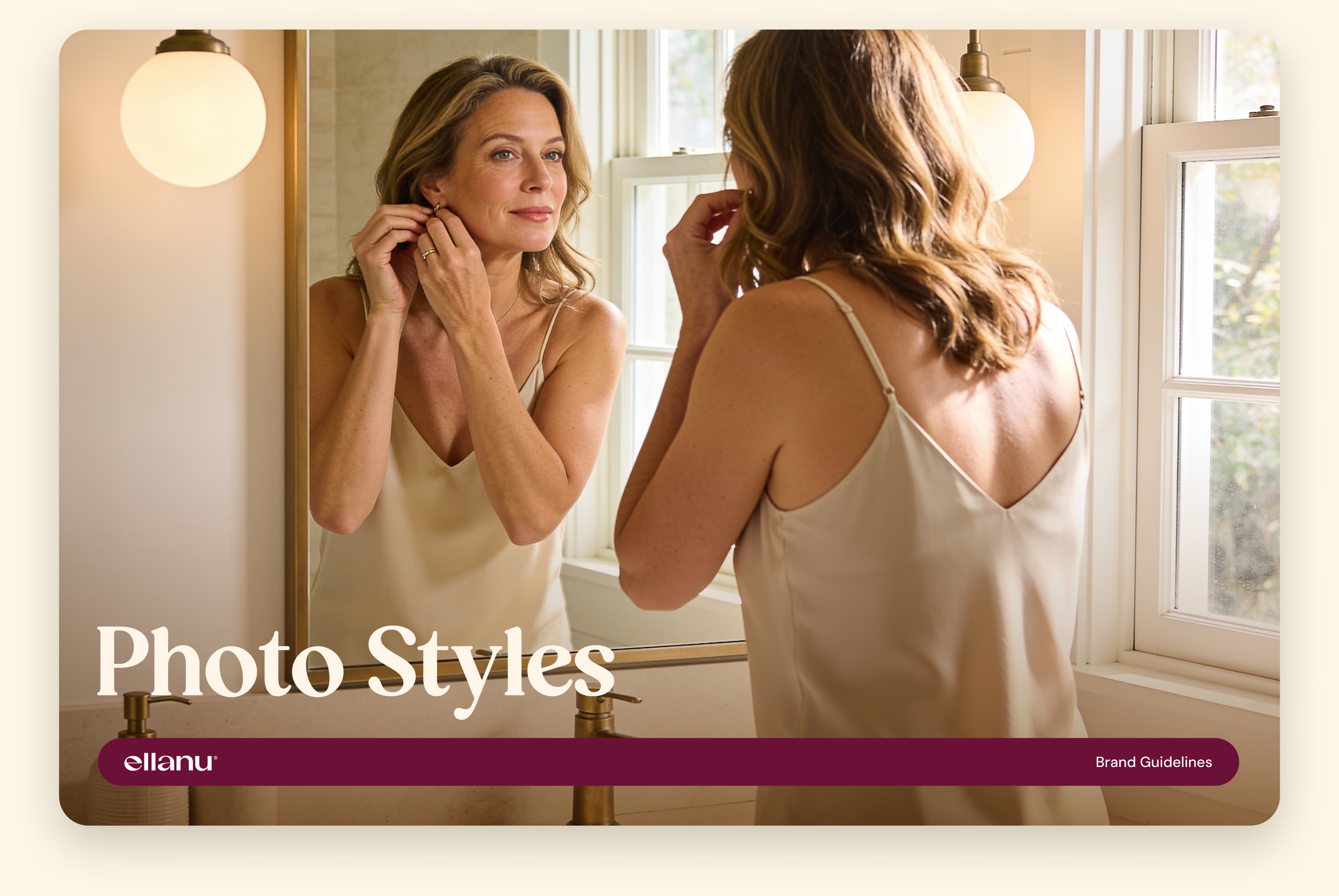
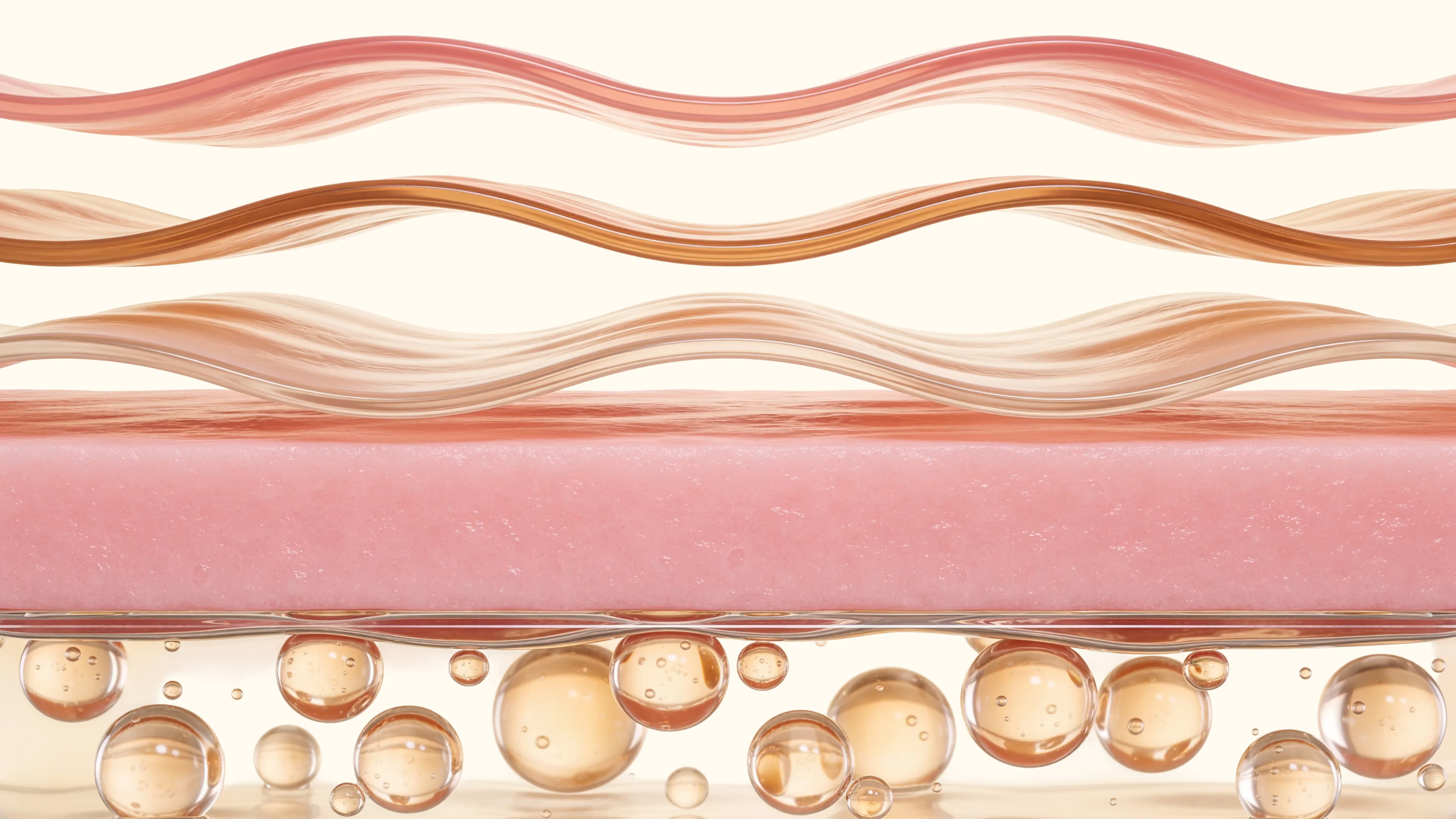
Photography added the human side of the story, with women and couples in everyday routines creating a sense of comfort and intimate familiarity. More technical visuals — including ingredient graphics, custom icons, and the skin-barrier illustration — gave EllaNu a way to explain what was happening in the body without turning the experience into a clinical diagram.
Together, those elements gave the brand room to communicate both the science behind the products and the lived experience of the women using them.








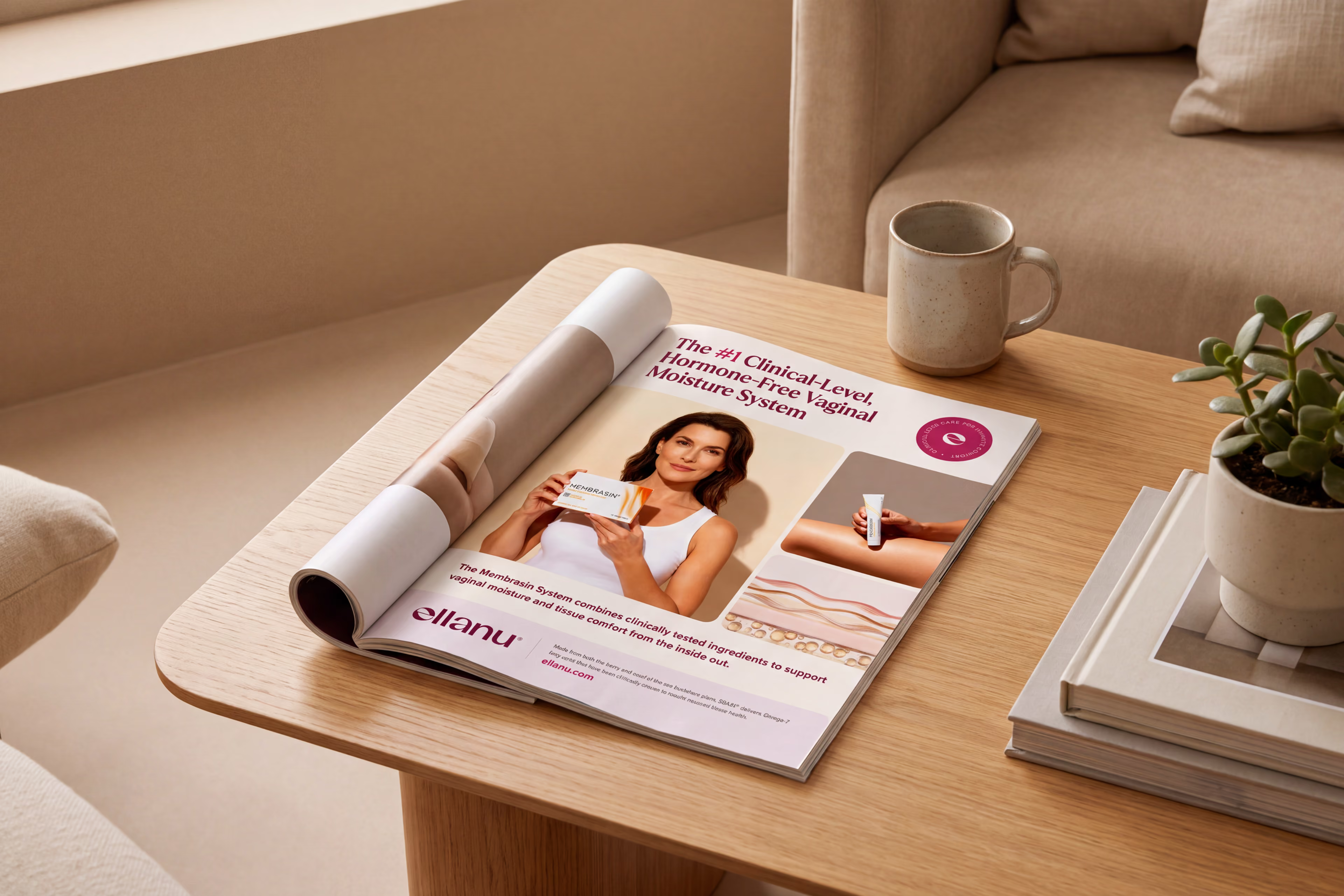

EllaNu 2.0 brings the brand into alignment around a more focused way of talking about intimate health. Women can understand what the products are for, why they work, and where they fit into daily life without having to decode the brand along the way.
As EllaNu grows, the brand has room to evolve without losing the way it now speaks to women and helps them make sense of what’s changing in their bodies. New products and campaigns can feel like a natural extension of EllaNu, even as the brand expands into more areas of intimate health.